VI|Signage|Products
Tsutaya Shoten (Bookstore)
In 1983, Tsutaya Shoten bookstore debuted in Hirakata, Osaka as a shop offering lifestyle ideas through books, films and music. Tsutaya Shoten opened in Tokyo's Daikanyama in 2011 as an attempt to create a new market by reconnecting with their original customers, the postwar baby boom generation.
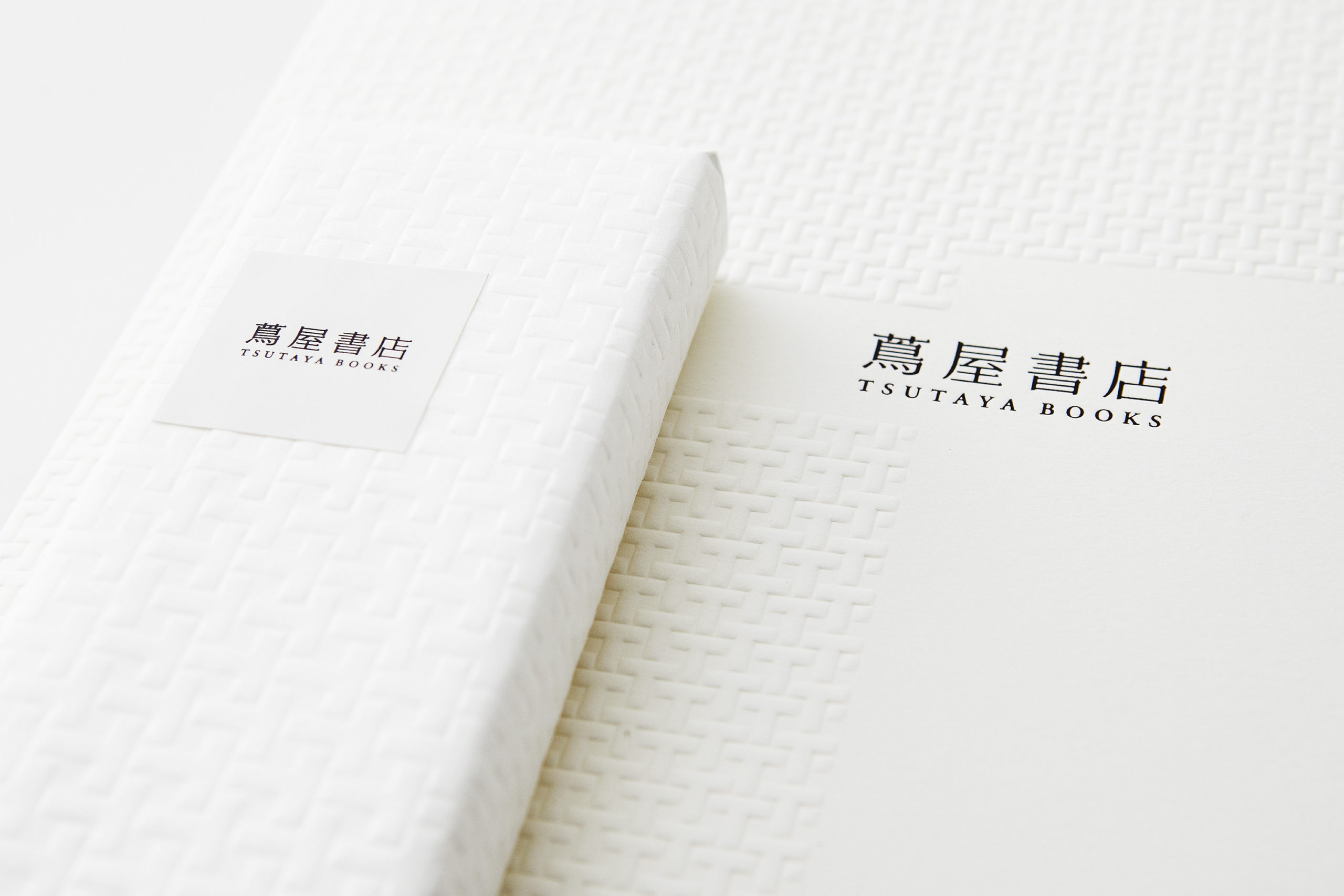
VI system
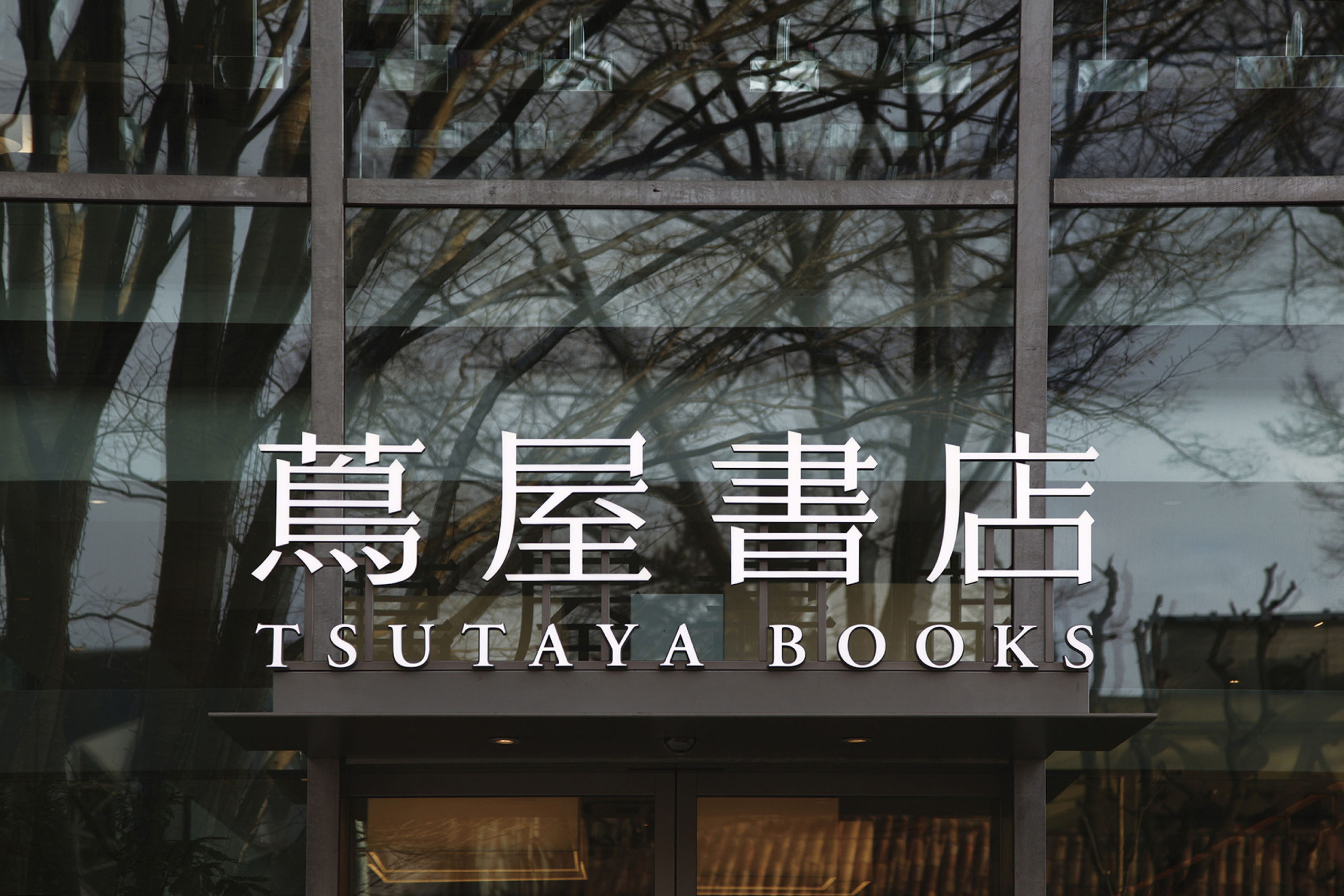
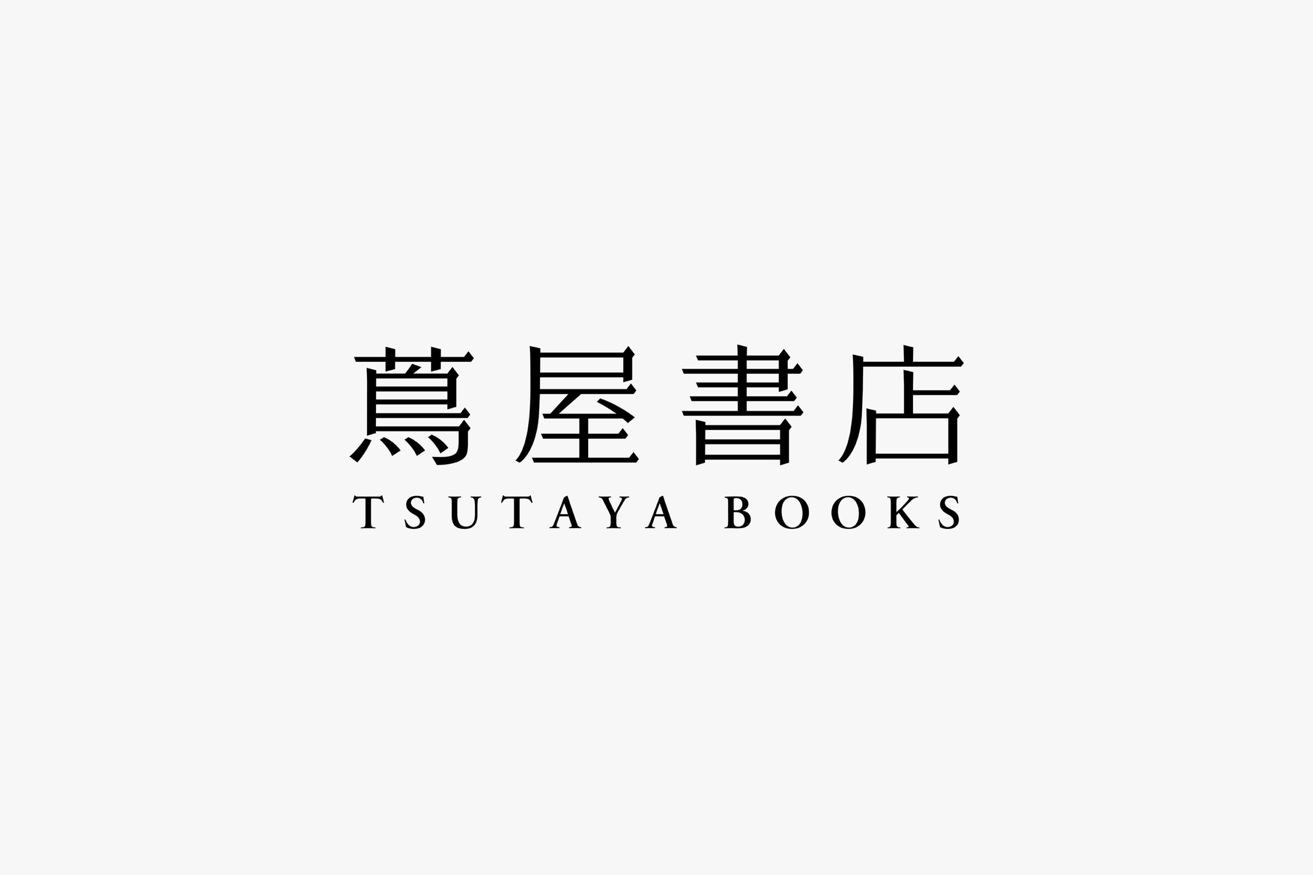
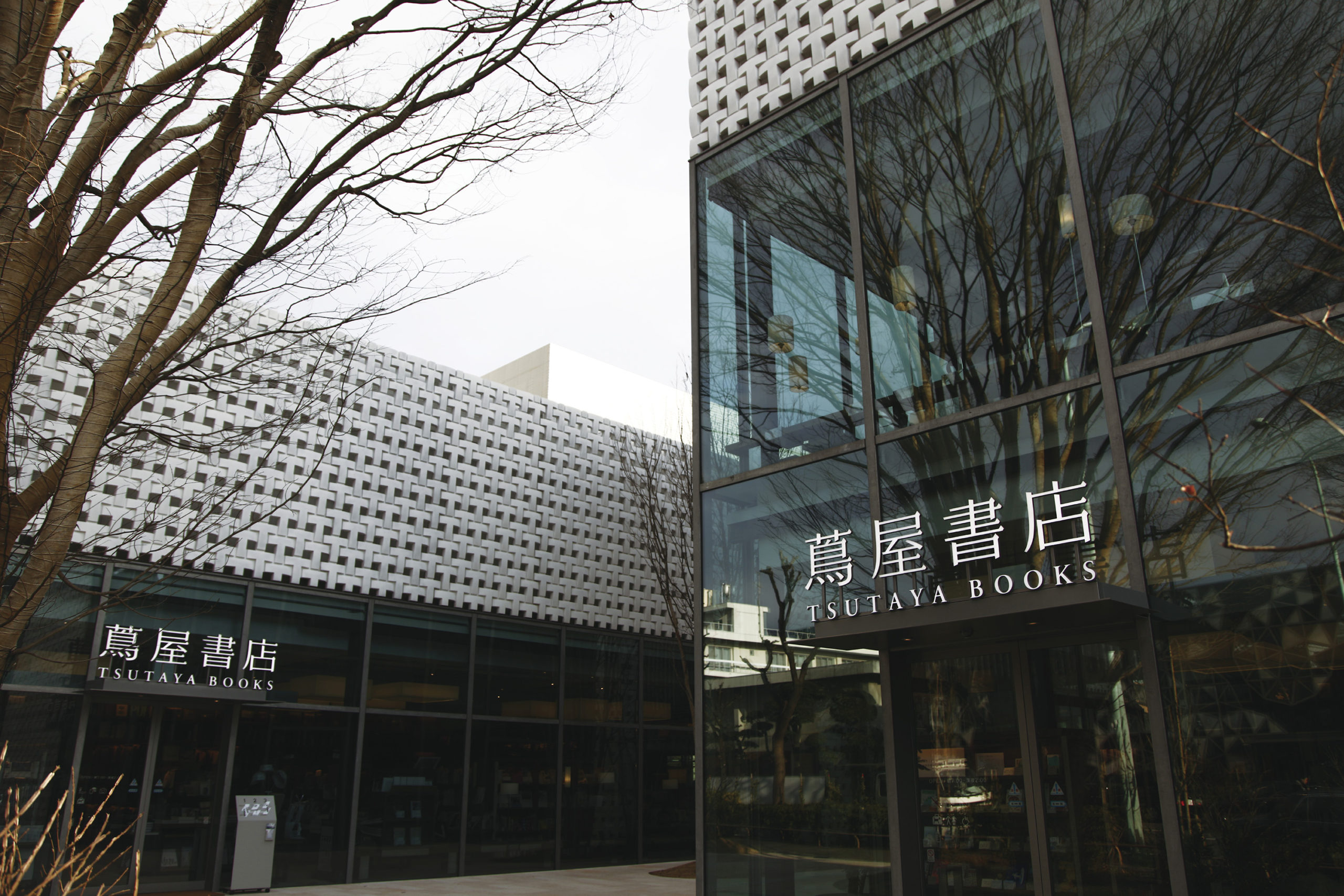
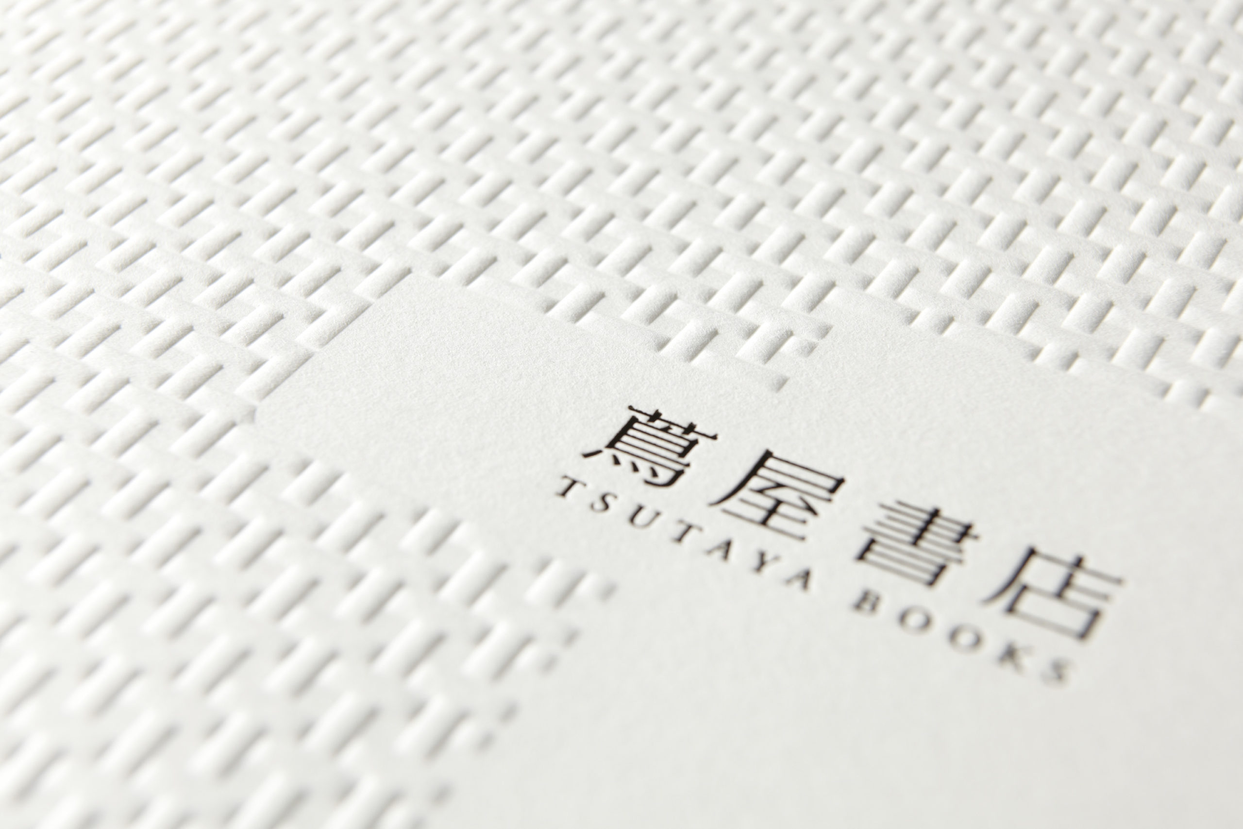
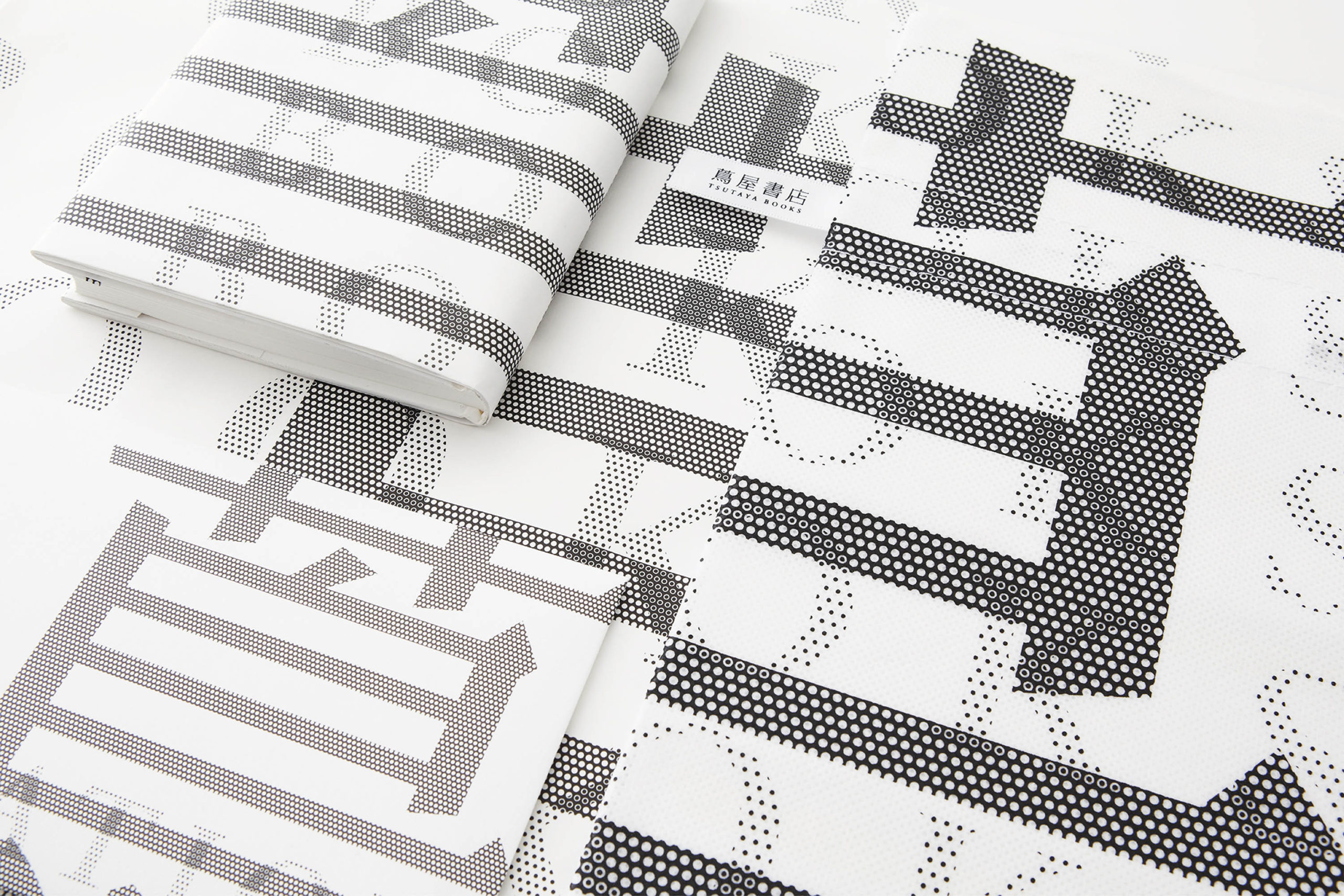
The Daikanyama Tsutaya Shoten (bookstore) project is symbolized by the logo renovation. We replaced the Roman letters with the Chinese characters (kanji) for Tsutaya Shoten:蔦屋書店. The logotype is concise and easy to read. We developed the VI system by separating the logo into an arrangement of dots.
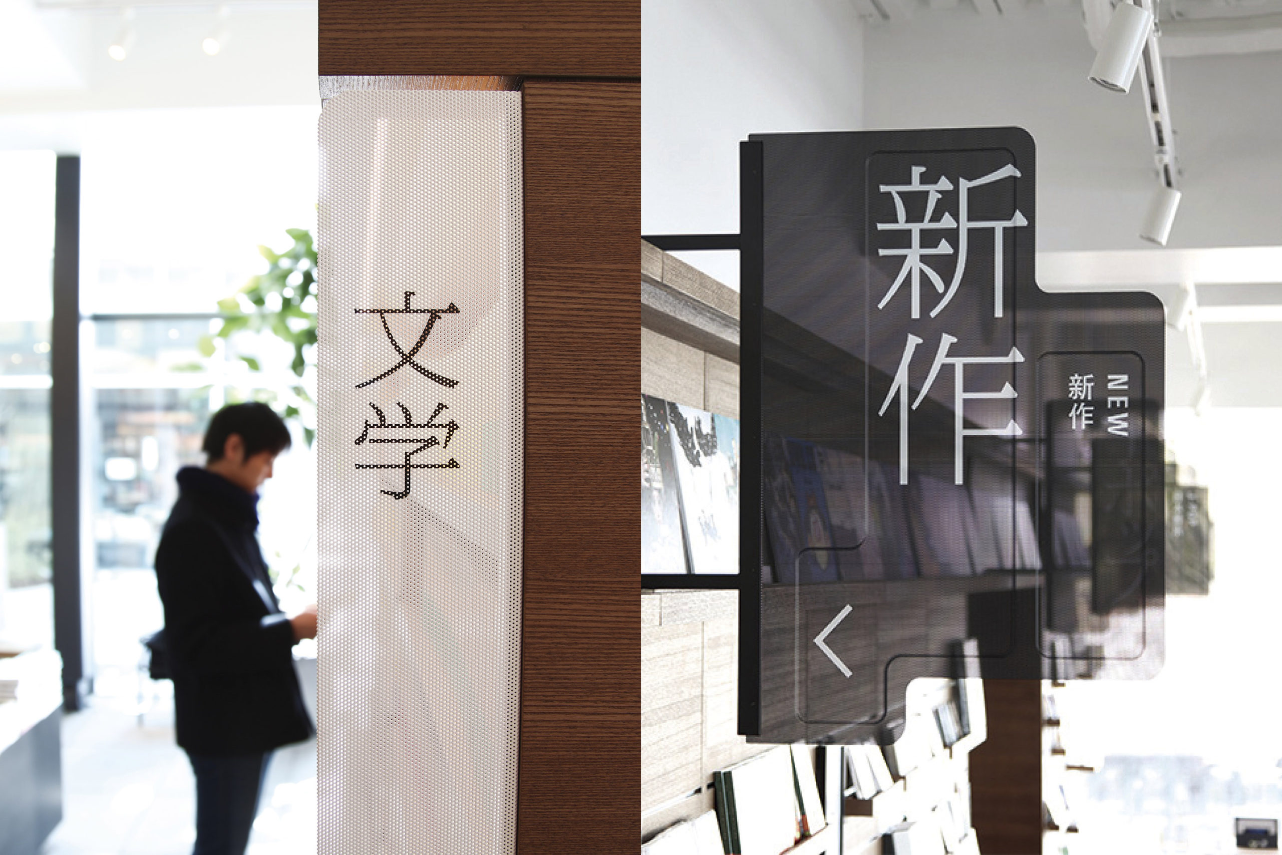
Sign System
By stamping sheet metal, we fashioned extremely thin, semi-translucent signage. Large letters are placed where they can be easily read. This light, permeable sign allows for visible verification from both sides.
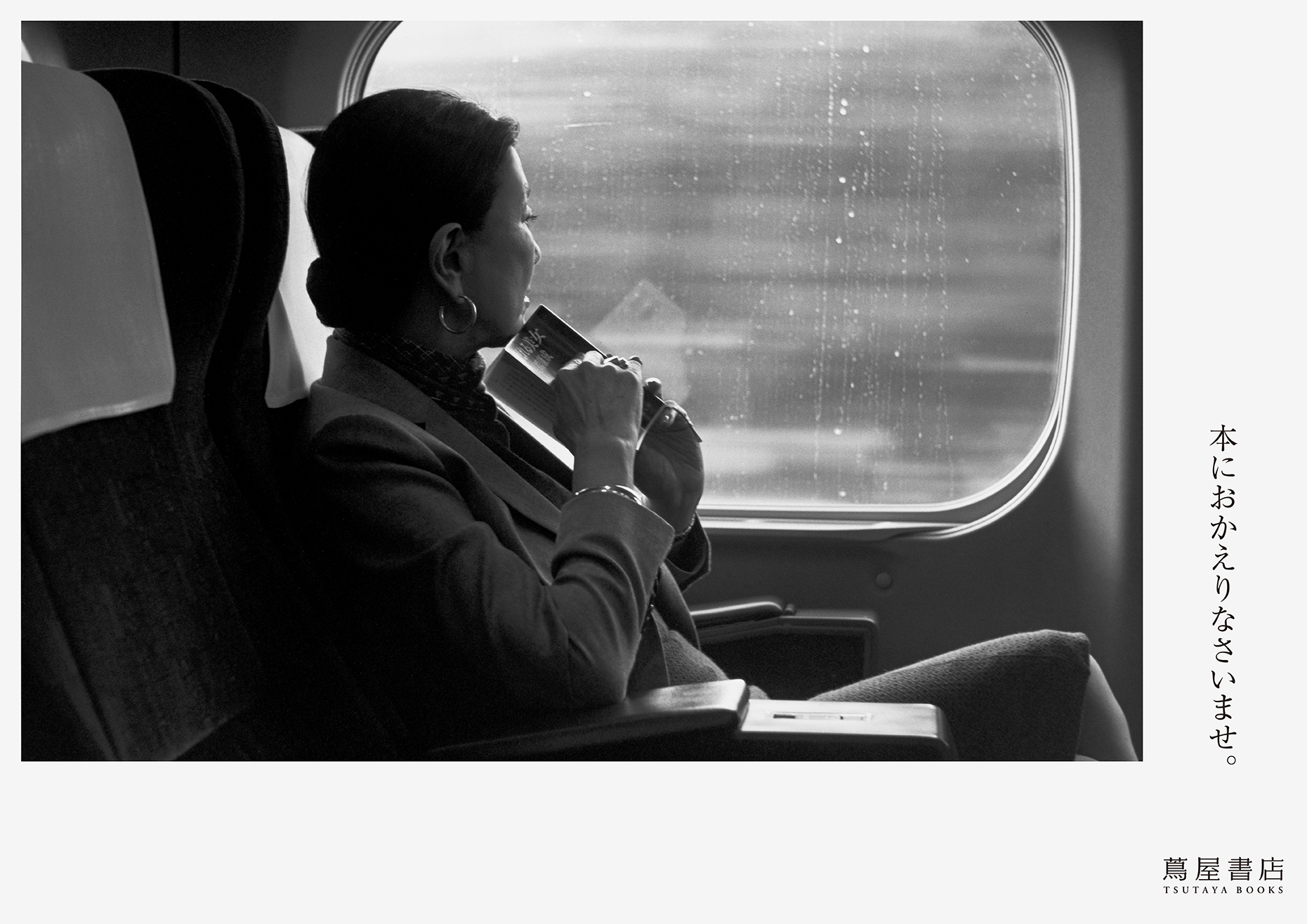
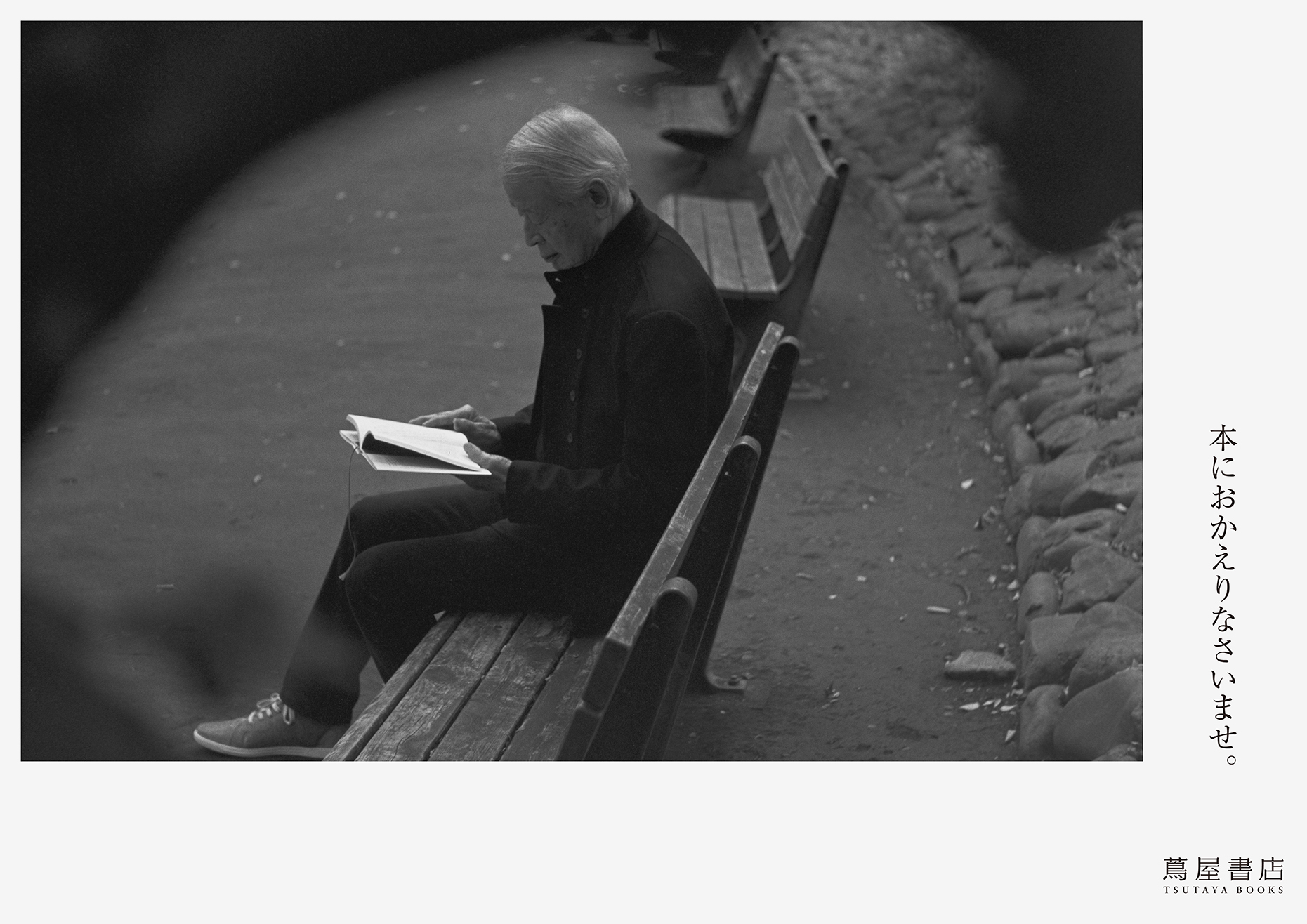
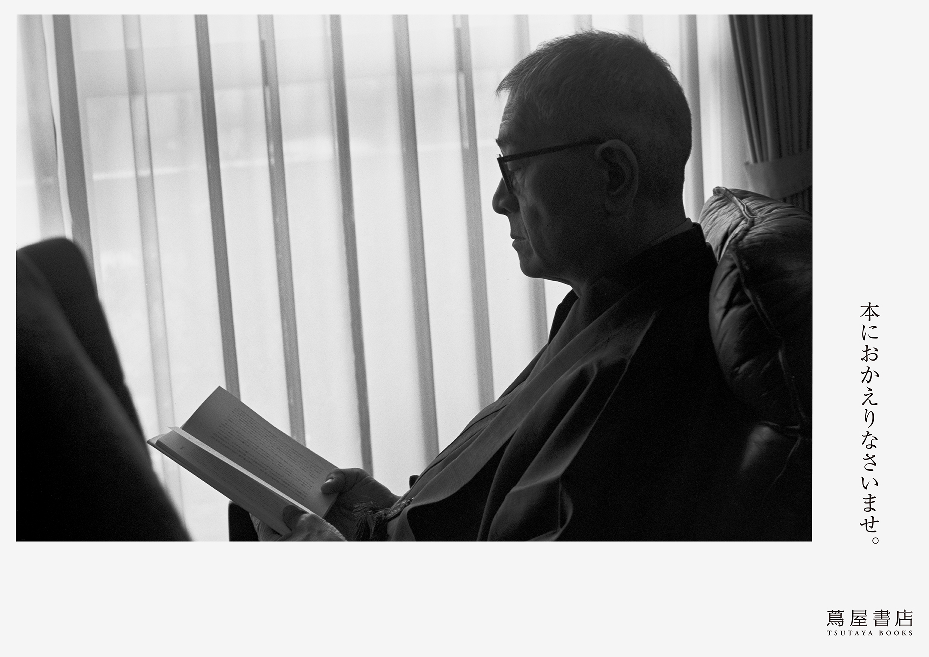
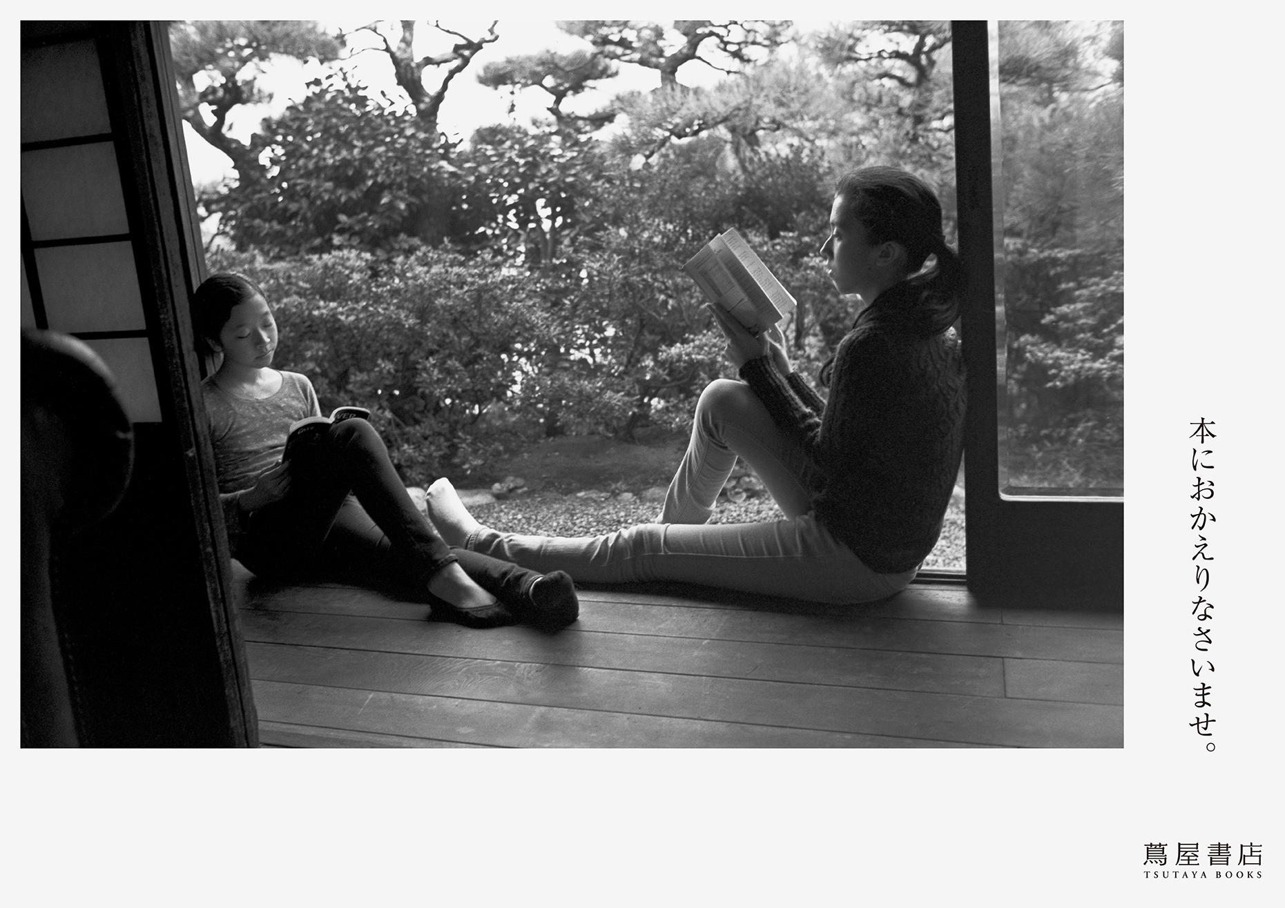
Advertising
The first ad featured an image of a person reading a book, focusing on the dignity of adults who live a principled life. The copy says, "Welcome back to books".
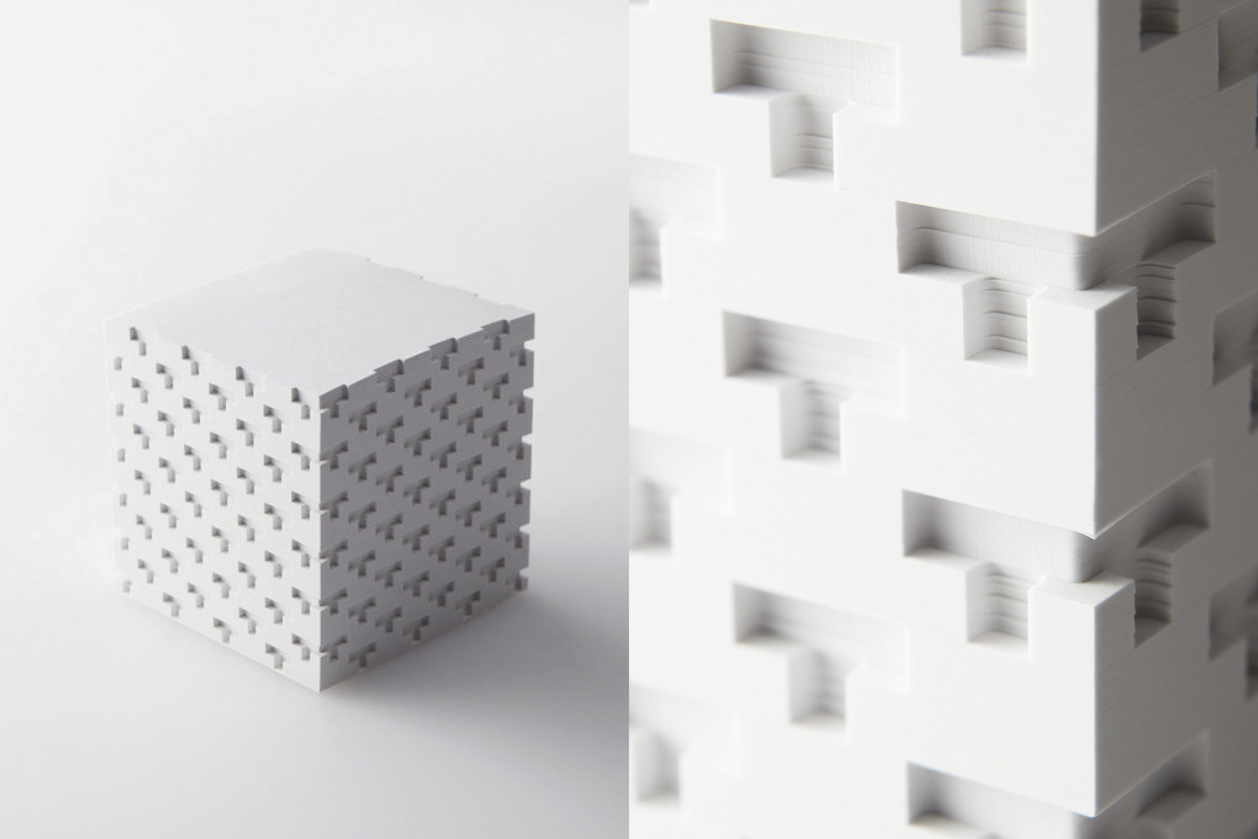
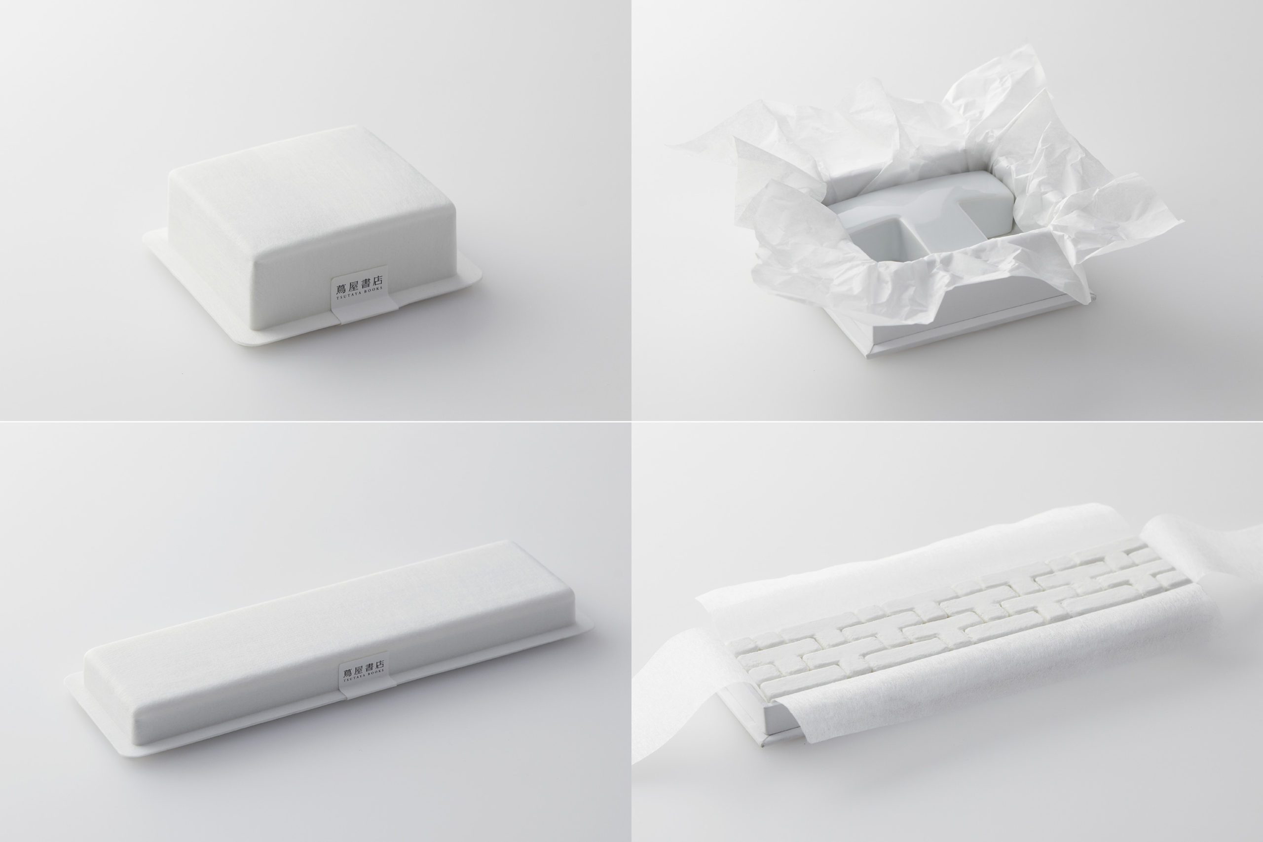
Novelty Goods
These novelty goods are based on the vocabulary of an architectural facade. The unevenness of the white “T” of “Tsutaya” was the consistent element.
Credits
VI System, Sign System, Applications
2011
AD: Kenya Hara
D: Kenya Hara, Kaoru Matsuno, Haruka Misawa, Naoko Sasaki, Hiroaki Kawanami
C: Ryo Hasumi
Pr: Nao Uchida
Web Design: Hiroyuki Saito
Advertising
2011
AD: Kenya Hara
D: Kenya Hara, Kaoru Matsuno
Ph: Yoshihiko Ueda
C: Munenori Harada