Shibuya Tsutaya update
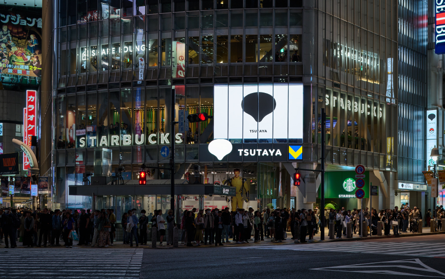
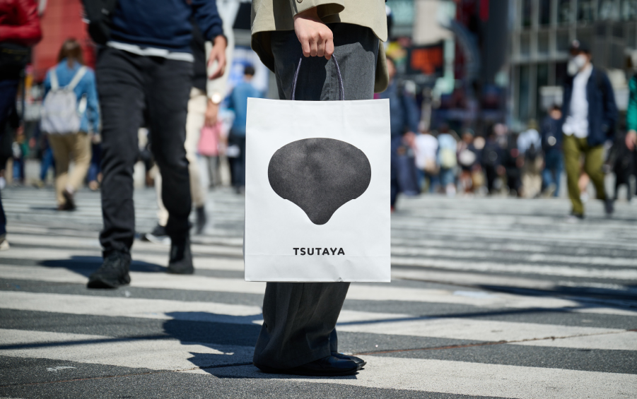
Located in the center of Shibuya, Shibuya Tsutaya attracts tourists from all over the world.
Hara Design Institute is responsible for the update of its visual identity.
The intellectual property content that is being created day after day has connections to a wide range of businesses, and this creates new cultural vortices over and over again.
Shibuya Tsutaya serves as a platform for this kind of content, so we aimed to create a virtual identity design that would be soft, lively, and approachable, so that it would be compatible with new spaces that will convey the appeal of various forms of entertainment through actual experiences such as pop-ups and other events.
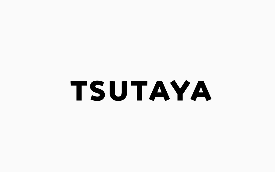
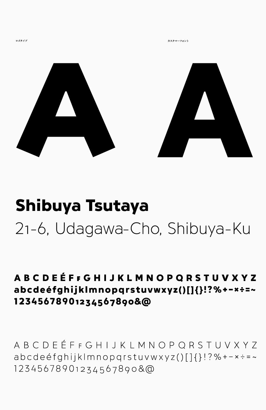
Taking the “T” from Tsutaya as its motif, the logo has a soft shape that looks almost like dripping liquid or rising gas, symbolizing a place where various forms of entertainment coalesce and are shared with a broad audience.
While the typeface used is neat and simple, the angled ends of the legs of letters like A and Y give it a sunny character.
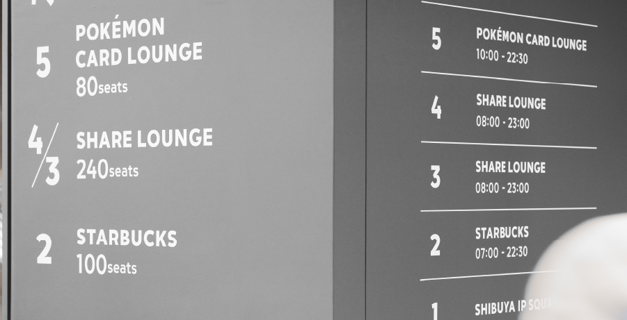
Sticking to the same sunny and approachable typeface, the signage is intended to be highly legible so it can be understood by anyone, and it is precisely designed right down to the edges of the letters.
The store is worth a visit when you are in the area.
Hara Design Institute is responsible for the update of its visual identity.
The intellectual property content that is being created day after day has connections to a wide range of businesses, and this creates new cultural vortices over and over again.
Shibuya Tsutaya serves as a platform for this kind of content, so we aimed to create a virtual identity design that would be soft, lively, and approachable, so that it would be compatible with new spaces that will convey the appeal of various forms of entertainment through actual experiences such as pop-ups and other events.
Taking the “T” from Tsutaya as its motif, the logo has a soft shape that looks almost like dripping liquid or rising gas, symbolizing a place where various forms of entertainment coalesce and are shared with a broad audience.
While the typeface used is neat and simple, the angled ends of the legs of letters like A and Y give it a sunny character.
Sticking to the same sunny and approachable typeface, the signage is intended to be highly legible so it can be understood by anyone, and it is precisely designed right down to the edges of the letters.
The store is worth a visit when you are in the area.
Credits
AD: Kenya HaraD: Kenya Hara, Kaoru Matsuno, Yongqiang Dai, Xin Zhong, Hiroshi Hosokawa, Natsu Kobayashi
Camera: Rui Hosokawa, Kazuki Majima, Hikaru Miyata
Motion Graphic: Xin Zhong
P: Yoshifumi Nabeta, Haru Matsunaga
Client: Culture Convenience Club Co., Ltd.