New visual identity for Nitro Plus and Nitro Origin
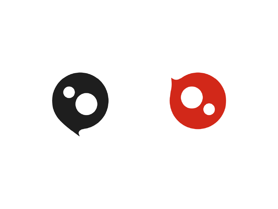
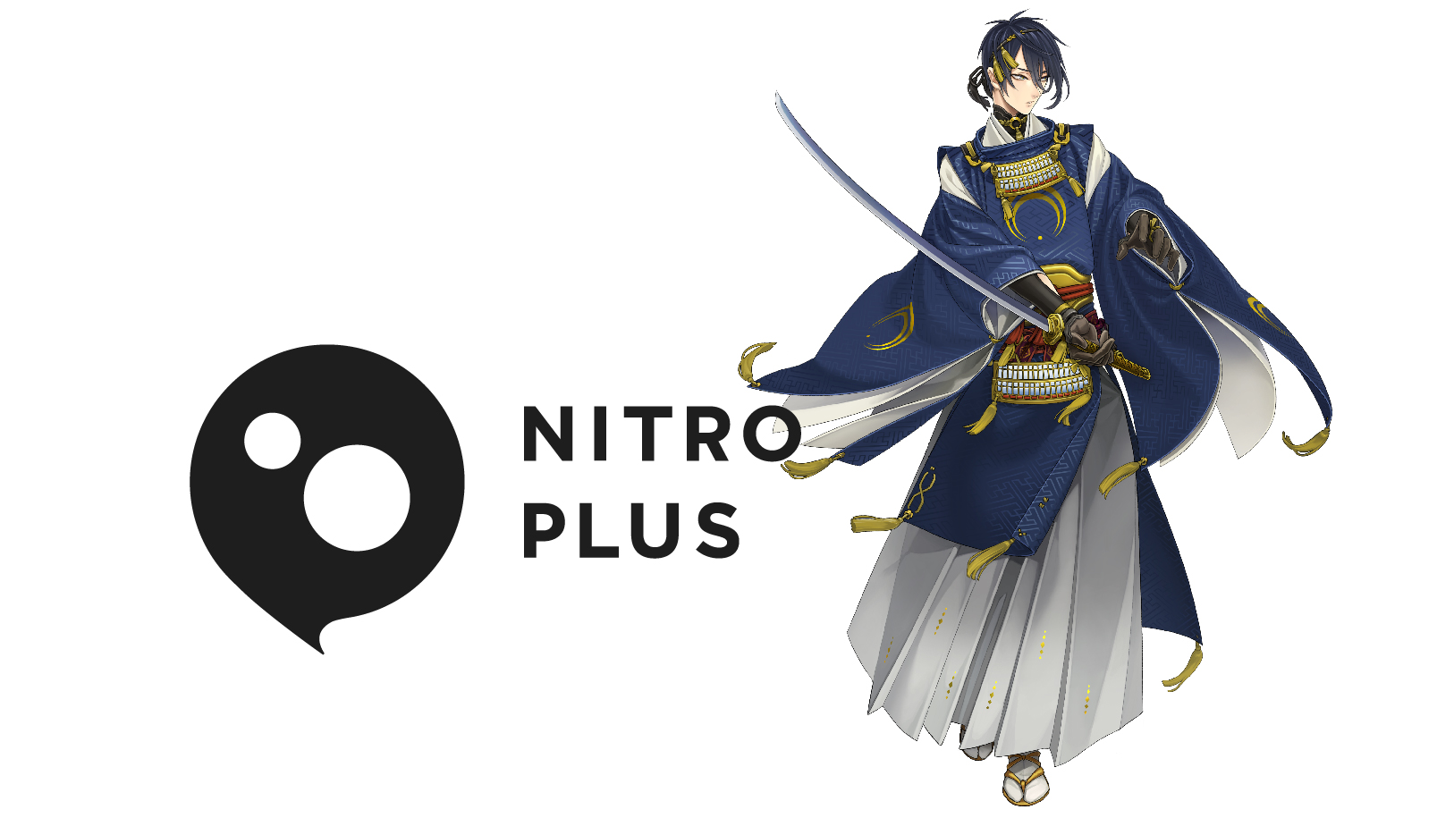
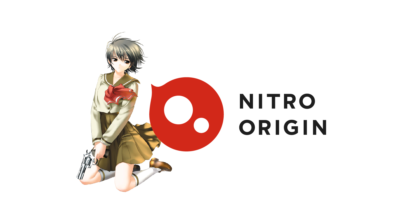
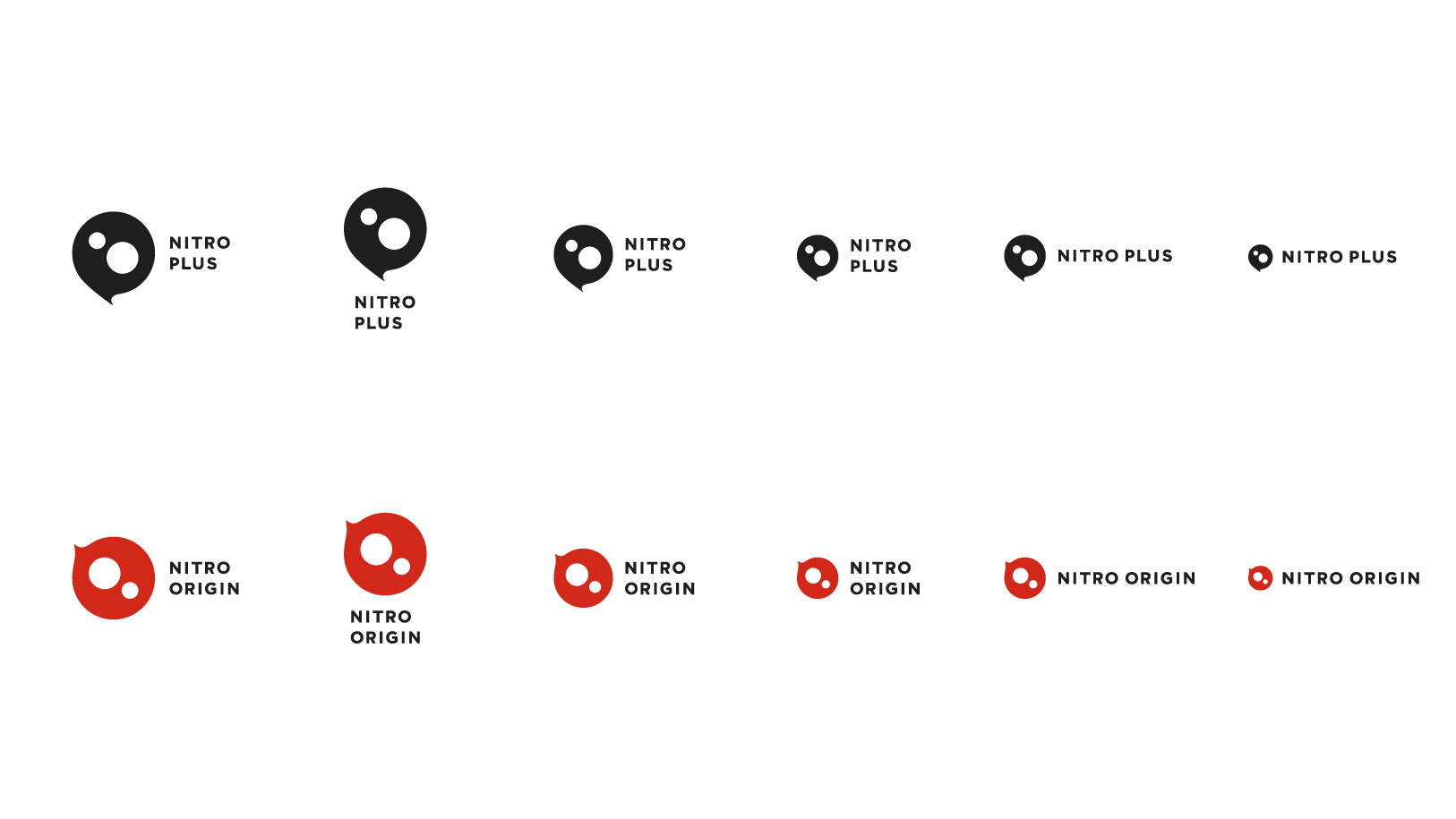
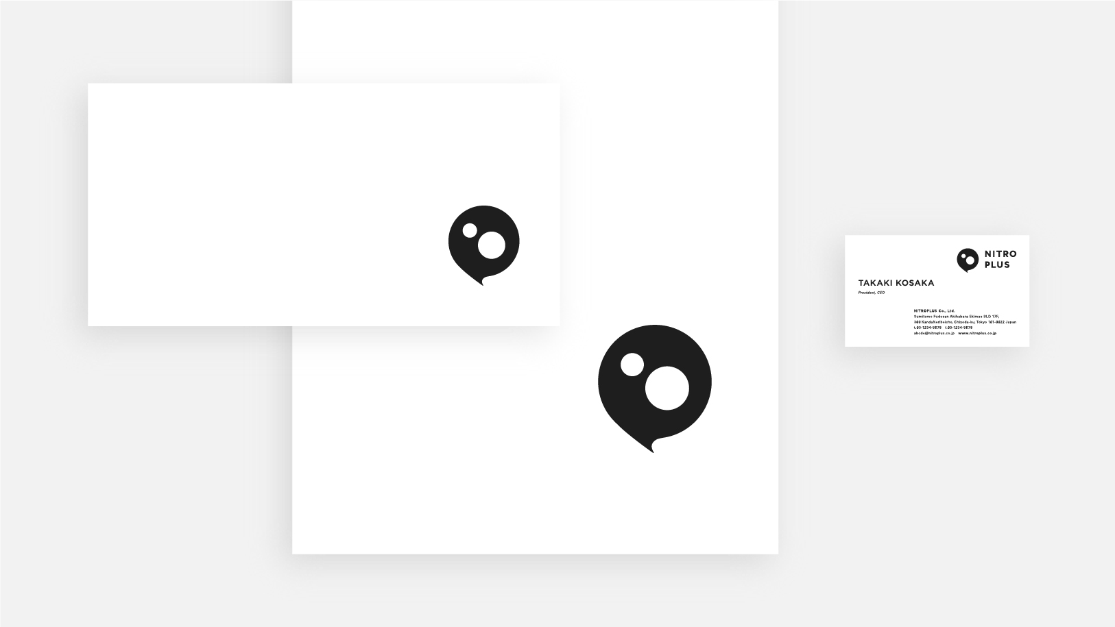
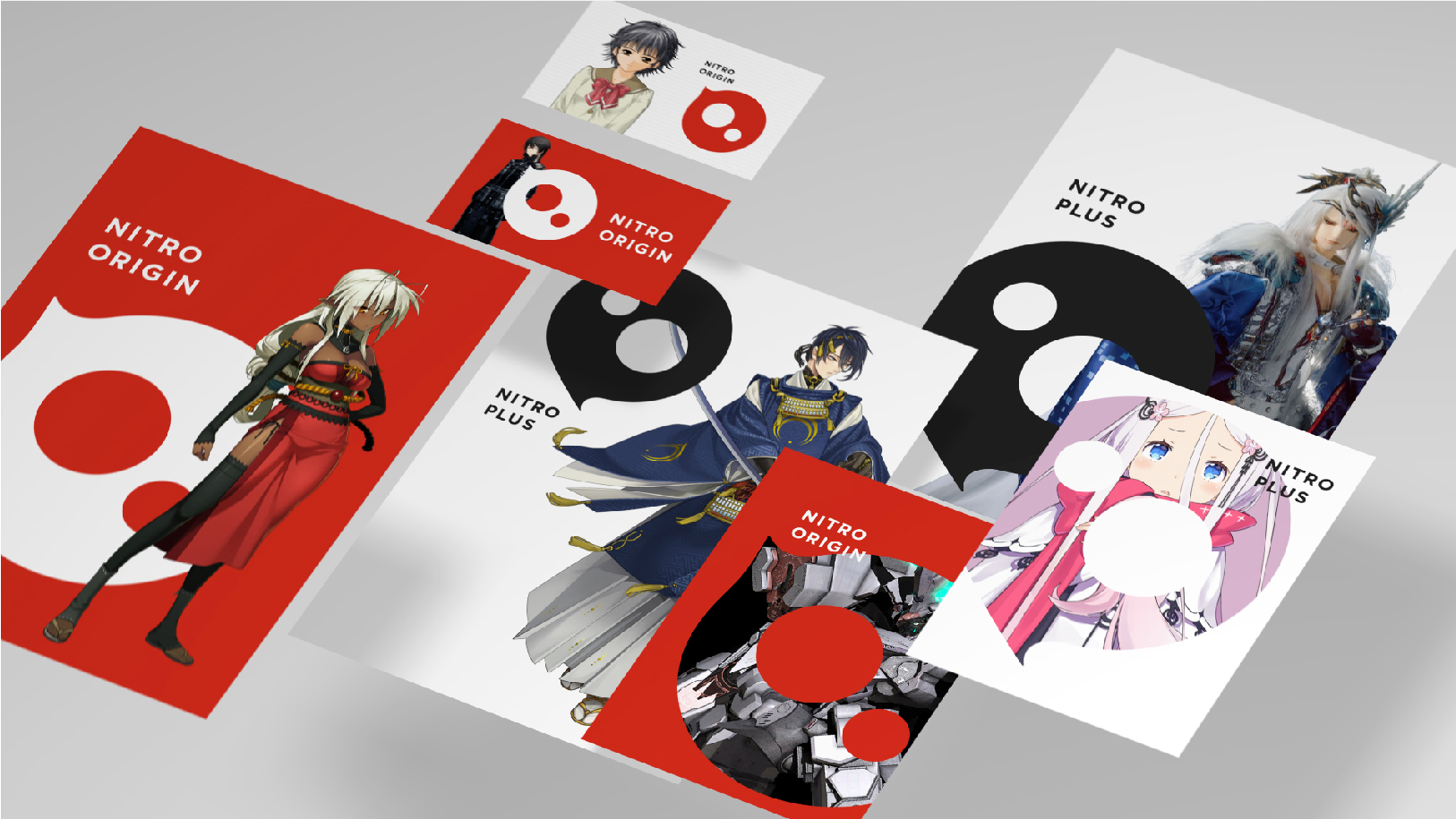
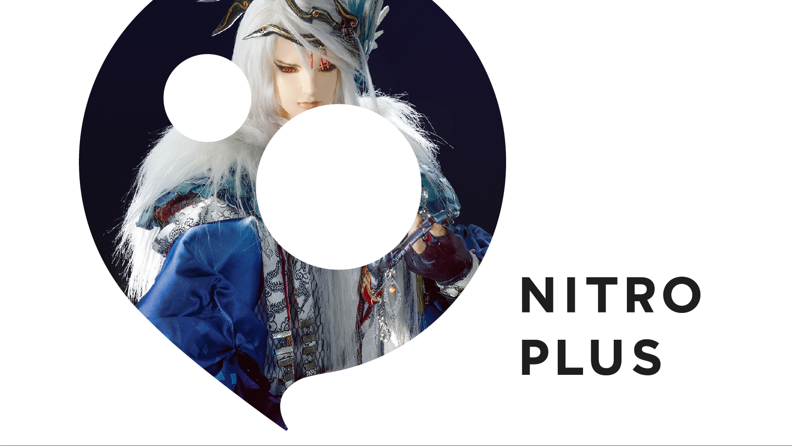
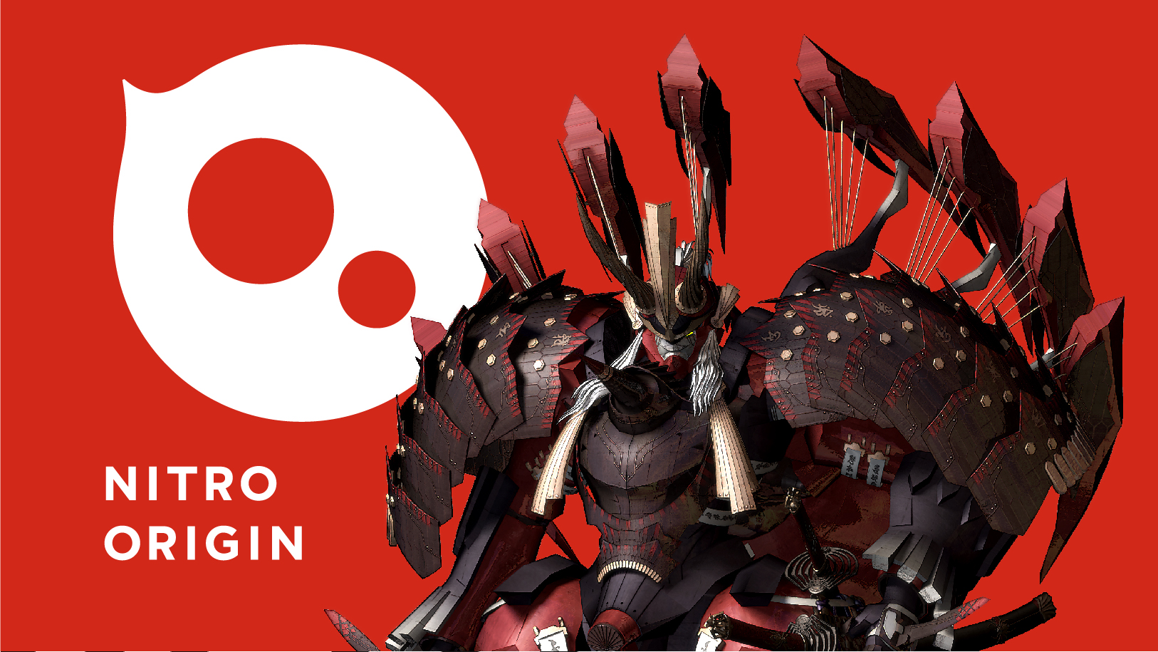
Nitro Plus and Nitro Origin are brands that provide distinctive Japanese content worldwide in a broad range of media and creative fields, including animation, games, and theatrical stage performances. The appeal of these brands can be symbolized by sparkling eyes and spiky projections that feel alert and full of life. In the new visual identities, these are expressed as combinations of three circles and a spike to create symbol marks that are kawaii and original. The two marks convey the shared heritage and the difference between the two brands, with outward forms derived from the “P” of Plus and “O” of Origin. The logotypes are designed to be legible at small sizes. Six signatures were created for each brand, bringing together the symbol marks and logotypes. And, as can be seen in the video, merging the symbol marks with visuals in content is actively encouraged, instead of being banned like it would be in a regular visual identity. The speech balloon-like shape was adopted so as to go well with content visuals. These design choices help Nitro Plus and Nitro Origin to develop their own distinctive brand identities.
Nitro Plus and Nitro Origin visual identity webpage
https://www.nitroplus.co.jp/company/vi/
YouTube video link
https://www.youtube.com/watch?v=Ek-dUMBT1rg
Nitro Plus and Nitro Origin visual identity webpage
https://www.nitroplus.co.jp/company/vi/
YouTube video link
https://www.youtube.com/watch?v=Ek-dUMBT1rg
Credits
AD: Kenya HaraD: Haruna Furusato, Xin Zhong, Hiroshi Hosokawa
Movie: Xin Zhong, Hiroshi Hosokawa
Music: Heima*
Web: Xin Zhong, Hiroshi Hosokawa
*Outsourced
©NITRO PLUS ©NITRO ORIGIN
©2015 EXNOA LLC/NITRO PLUS
©2016 Tunderbolt Fantasy Project
©NITRO PLUS/GOOD SMILE COMPANY, Inc.